
95%
BUSINESS UNIT ADOPTION
Template adopted across business unit's service portolio, with adjustments based on service type.
6+
brochures created
Generated for different service categories within the first 6 months of implementation.
AA
ACCESSIBILITY LEVEL
Structured for seamless navigation with assistive technologies and WCAG compliance.


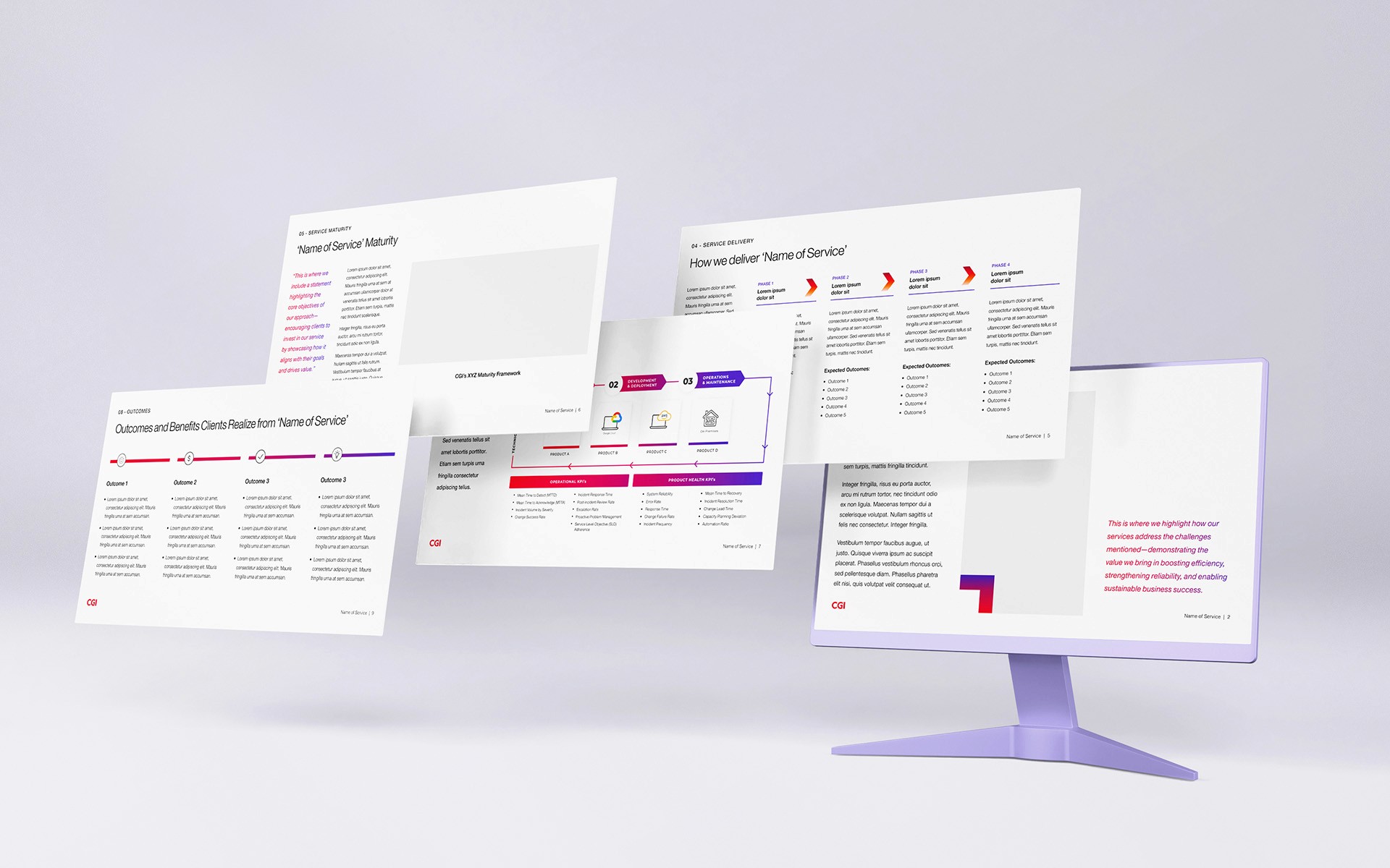
GTOX Brochure Template
11-page digital brochure template communicating the value of IT services for pitch presentations and client communications.
Client
CGI Inc.
Role
Designer
Tools
InDesign, Illustrator
Timeline
Mar. 2025