

March — June 2025
A webpage design created for the Business Engineering team, ensuring seamless integration with the existing website structure and a user-friendly experience.
Note: Due to confidentiality, all content has been substituted with placeholders.

C O M P A N Y :
CGI Inc.
M Y R O L E :
Designer
T O O L S :
Figma, Adobe Illustrator
S C O P E :
User Research & Testing, IA, Interaction Design, Design System Implementation
The Business Engineering team reached out to us with a request to add a dedicated page to the GTOXperience website, aiming to help internal employees better understand the team's role, processes, and key reference materials.
The poor contrast and hard-to-read text make the content difficult to navigate and understand for users
The website features an overwhelming number of images, but lacks sufficient product details, making it difficult for users to get the necessary information to make informed purchasing decisions
The complex navigational structure and unconventional layout create confusion and hinder users' ability to find what they need easily
GTOXperience is an internal platform for consultants at CGI to learn about the IT services offered by the GTO business unit and easily access sales enablement materials.

A one-stop shop for service learning and sales enablement materials.
The poor contrast and hard-to-read text make the content difficult to navigate and understand for users
The website features an overwhelming number of images, but lacks sufficient product details, making it difficult for users to get the necessary information to make informed purchasing decisions
The complex navigational structure and unconventional layout create confusion and hinder users' ability to find what they need easily
"We had a share functionality, but no one used it."
Visual elements are misaligned, some buttons are hidden, and inconsistent colour and typography make the layout appear unpolished.

Users could not see what content would be shared before sending, creating uncertainty and hesitation.

The lack of Teams integration led users to avoid it entirely, opting to share content manually through Teams instead.
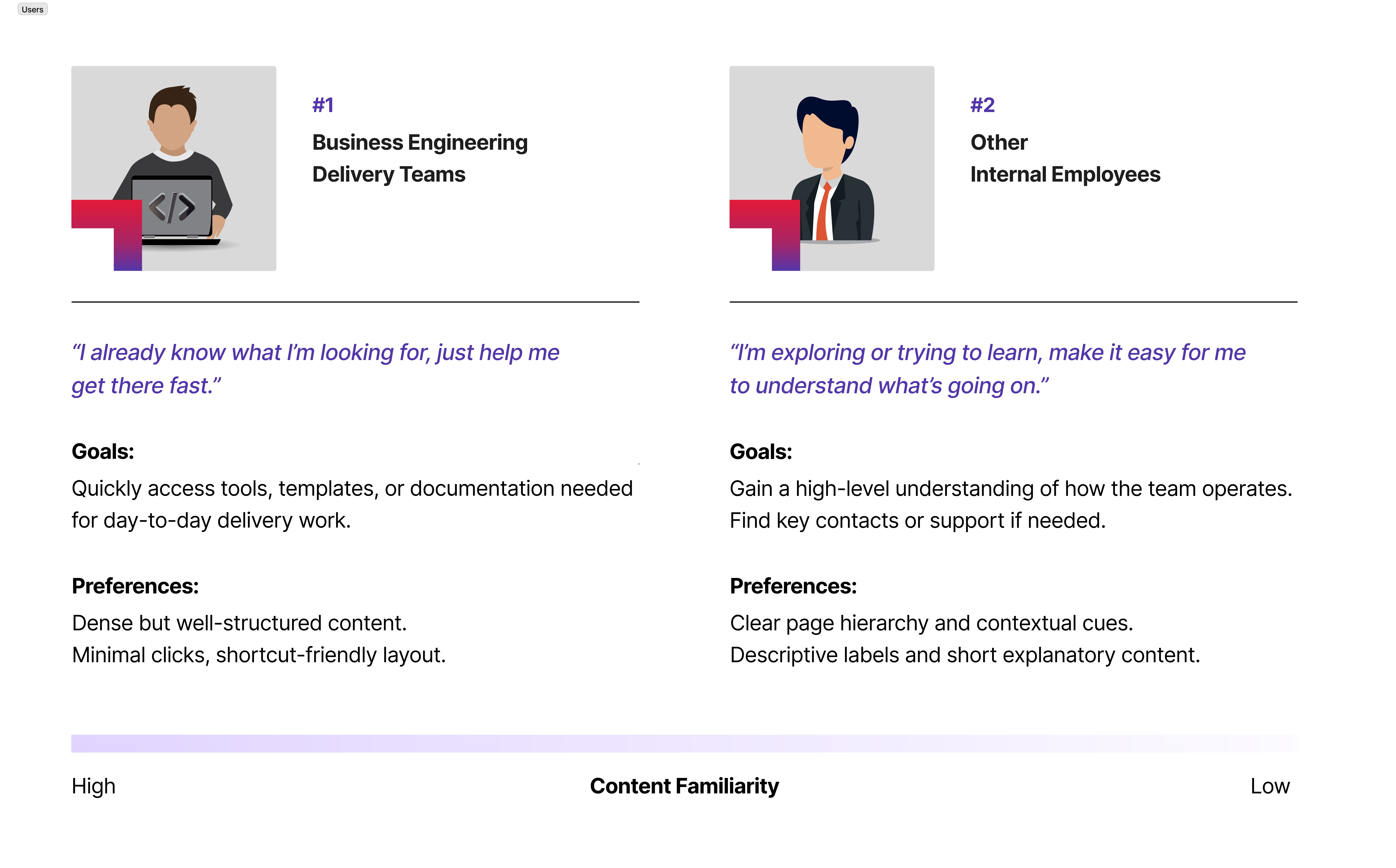
Before starting the design, I identified two key user types who are likely to use the webpage.
This helped ensure the design addressed varying levels of familiarity with the content, guiding new users while maintaing efficiency for experienced ones.
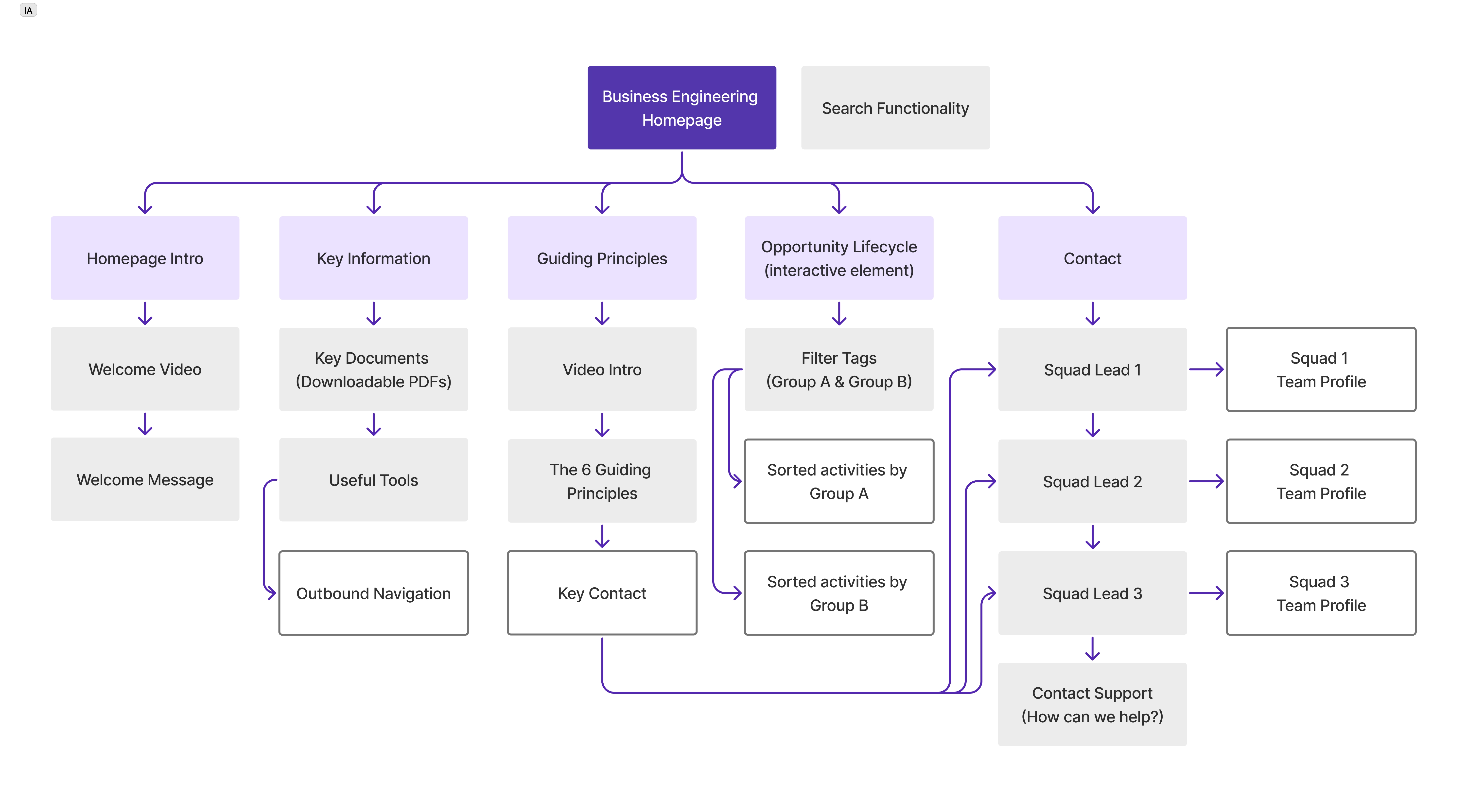
I created an information architecture to show how the content is structured, since the focus of this project was on layout and clarity rather than task-based user journeys.

Leveraging CGI's Design Systems, I built high-fidelity prototypes for internal testing and used the feedback to guide the next round of iterations.
When we get to the subpages that are not accessible via the dropdown menu, we can't go back to the previous page unless we click the browser's back button.
Is there a way we can include the org chart into the webpage, seeing all positions at once without any clicks?
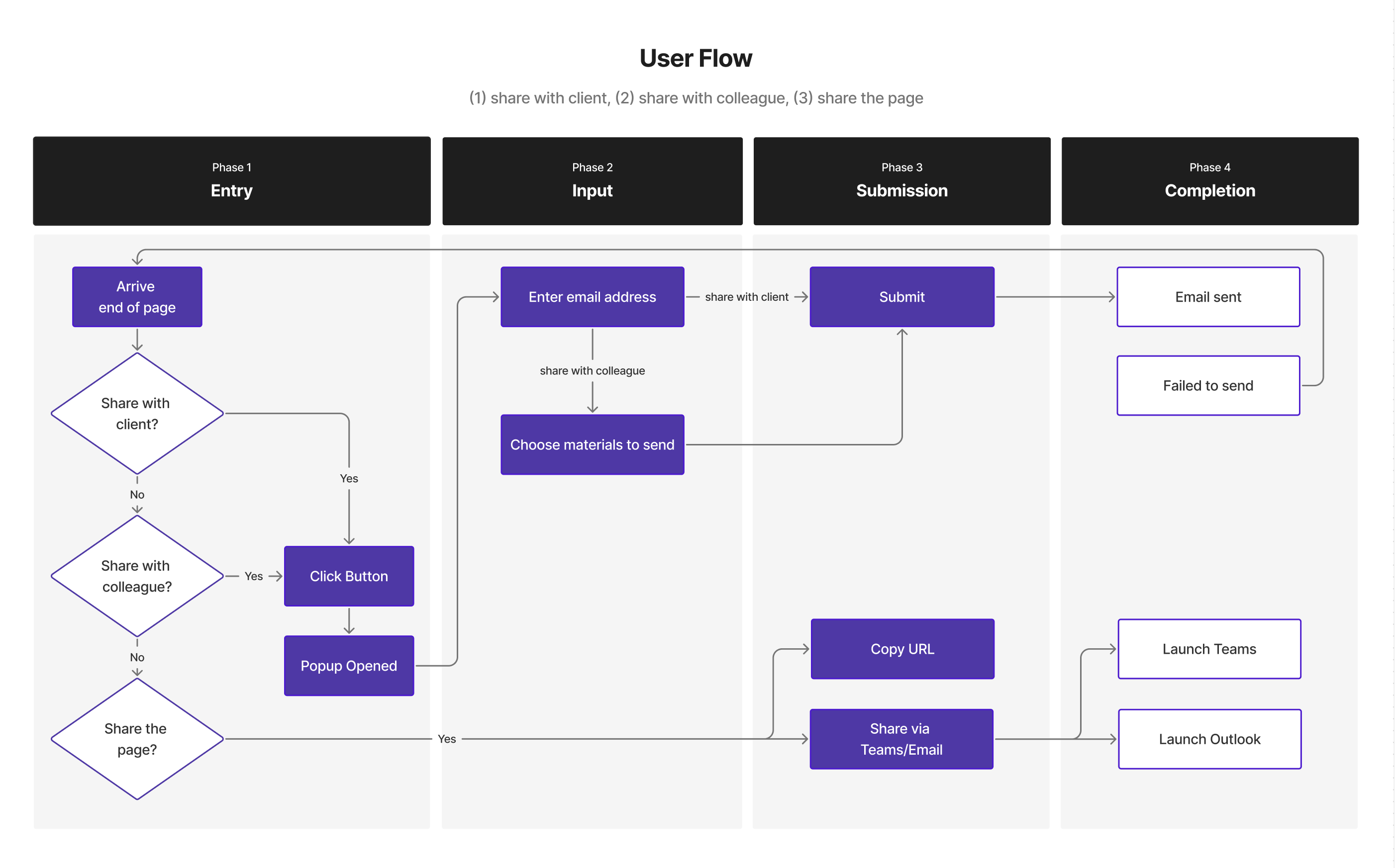
To map out the redesigned experience, I created a user flow that illustrates how users would navigate the system step by step. This helped identify key decision points and ensure the flow supported all 3 sharing options.
Select the image to see an expanded version.

Using CGI's most updated design system, I explored layout and interaction patterns that aligned with internal branding while addressing the usability issues identified during the research phase.
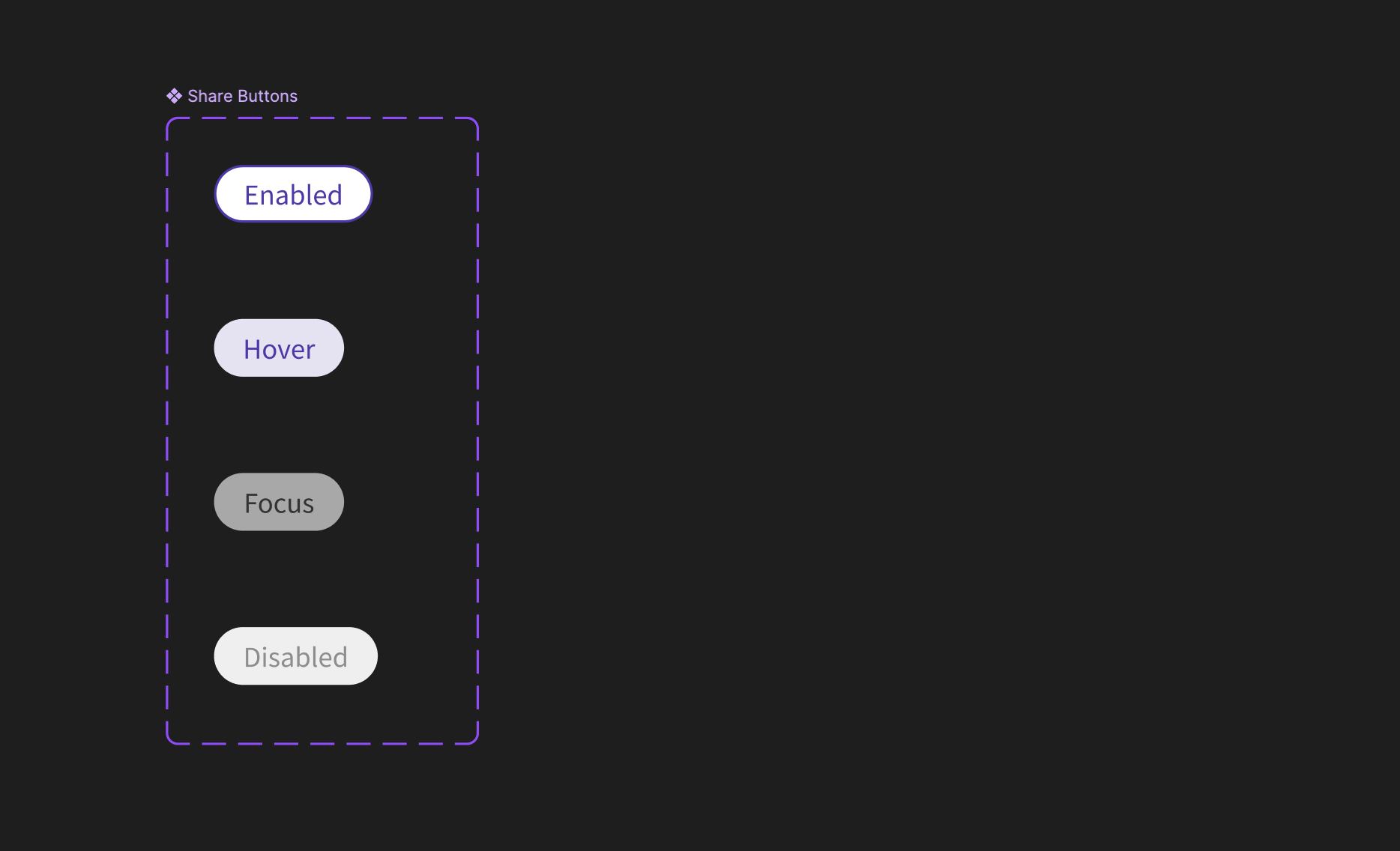
Buttons:
I followed CGI's button design standards and implemented various states, including Enabled, Hover, Focus, and Disabled.
Each state was designed to clearly communicate interactivity and guide users intuitively through the share process.
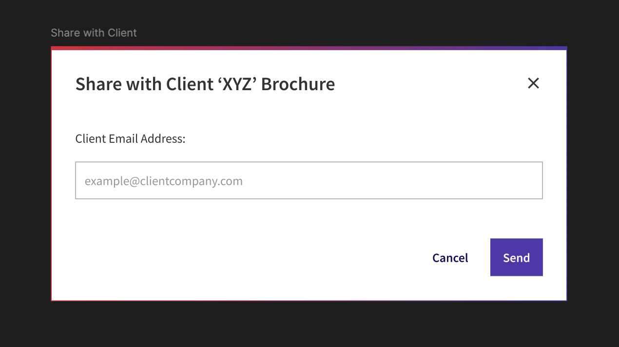
Card Popups:
The share popup was simplified to reduce cognitive load, with a clear call-to-action and input field.
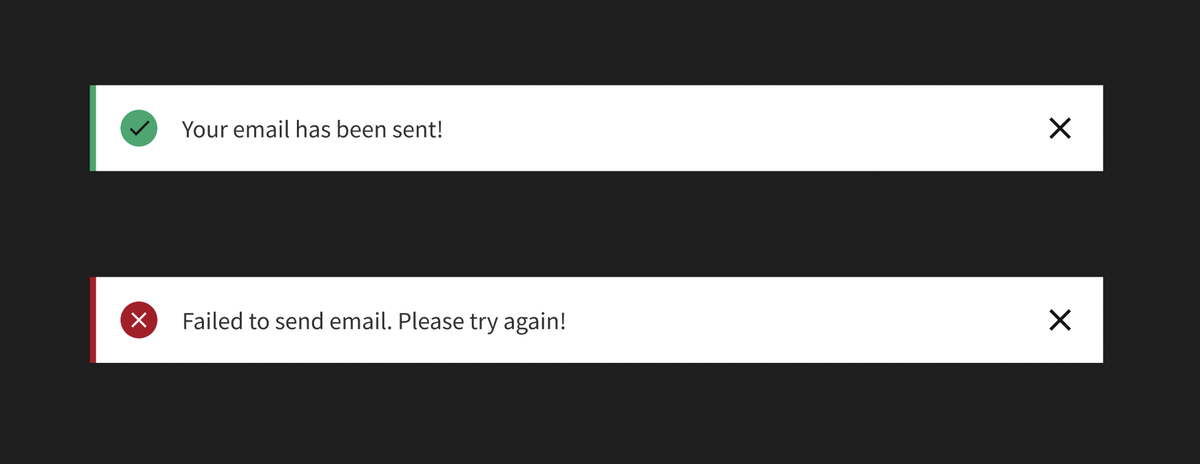
Alerts:
Previously, the success/error alert was embedded within the popup card, requiring the users to scroll down to access the 'Close' button.
To improve clarity and visibility, I introduced separate indicators that appear in the top-right corner after the popup closes.
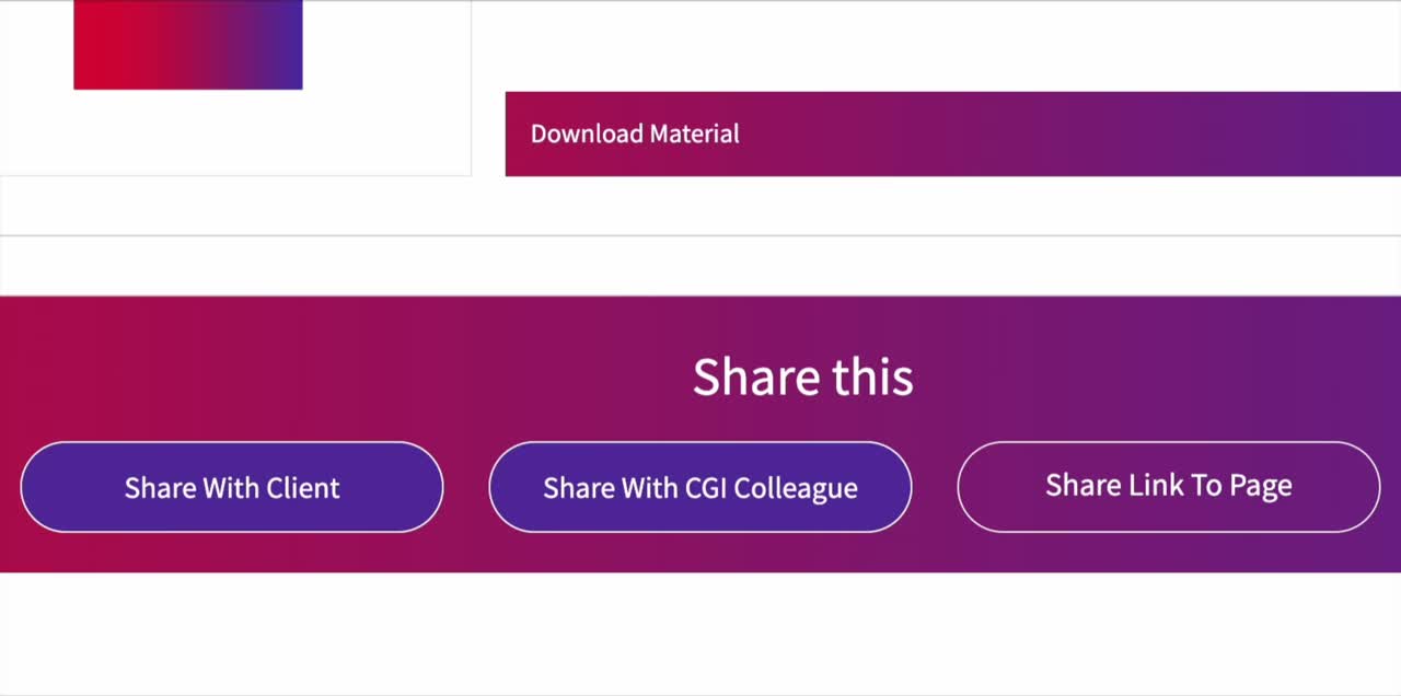
This section outlines the share feature with 3 buttons, each triggering a unique popup: client, colleague, or page link.

I redesigned the buttons using consistent padding, shape, and typography to unify their appearance and clearly distinguish each action.
The “Share this” heading is center-aligned with the button group to ensure visual balance.
Visual elements are misaligned, some buttons are hidden, and inconsistent colour and typography make the layout look unpolished

I differentiated visual styles between primary (Submit) and secondary (Close) buttons using CGI’s design system variants.
I added interactive states to the input field (purple border on focus and red on error) to provide immediate visual feedback.
The popup now closes automatically after sharing, and a success or error alert appears in the top-right corner to confirm the outcome.
Users could not see what content would be shared before sending, creating uncertainty and hesitation.

I added an option for users to select which materials to send to colleagues, giving them better control and visibility over what they’re sharing.
I also introduced an alert popup after sending to confirm the action was successful or notify them of any errors
Without Teams integration, users avoid the share feature entirely, opting to share content manually through Teams instead.

Since all three buttons share a similar visual style, I replaced the default Outlook launch with a popup.
It now offers options to copy the URL or share via Teams/email, keeping the interaction consistent with the other two buttons.
User Group 1:
"As a BE team member, I need fast access to key documents and tools, so I can focus on building solutions efficiently"

Given the time sensitivity of this user group and their familiarity with the content, I ensured quick access to resources by:
1. Adding the Key Reference Info and Useful Tools close to the top of the homepage, allowing downloads with a single click.
2. Compacting the Opportunity Lifecycle for quick access. Users can click on the steps they only need information from.
User Group 2:
“As an internal collaborator with little to no prior knowledge about BE, I need guidance through the available tools and resources to understand how and when to use them.”

Since this user group is less familiar with the content, I ensured that key resources were clearly labeled and accompanied by brief descriptions to guide navigation and understanding.
1. Reference Information and Useful Tools are accessible via a dropdown subpage with descriptions.
2. Expanded Opportunity Lifecycle displays all activities at once for easy comparison across filters.
User Group 2:
“As an internal collaborator, I want to understand what BE does and how I can work with them effectively.”
Based on Usability Testing:
“Is there a way we can include the org chart into the webpage, seeing all positions at once without any clicks?”

To support internal collaborators exploring resources, the Org Chart is presented as a pop-up, keeping the page uncluttered while giving quick access to team structure.
Squad Lead profiles on the BE homepage, with direct links to their Squad Teams, helping users find the right points of contact easily.
Based on Usability Testing:
“When we get to subpages, we can't go back to the previous page unless we click the browser's back button.”

I added breadcrumbs to subpages to give users a clear navigation path and allow them to easily return to previous sections without relying on the browser's back button.
I adapted the layout for mobile by optimizing spacing to ensure comfortable touch interaction.
Primary actions are placed within the thumb zone to enhance reachability and ease of use.

For the Opportunity Lifecycle, which uses hover effects on desktop, I designed a mobile-friendly alternative that accounts for touch-based interaction.
All steps are visible, and users can navigate through them by tapping arrows or using drag gestures.


As the project is still in progress, I’m currently testing the updated share button interactions and gathering stakeholder feedback to validate the design direction.
What's will be evaluated?
Visual clarity, interaction feedback, task efficiency, and stakeholder alignment.
Post launch, we observed a significant increase in the overall usage of the website.
Increase in site visits
Increase in downloads of materials


